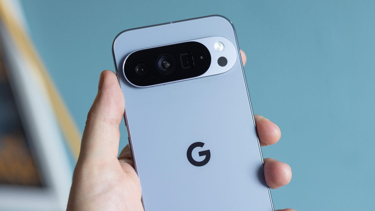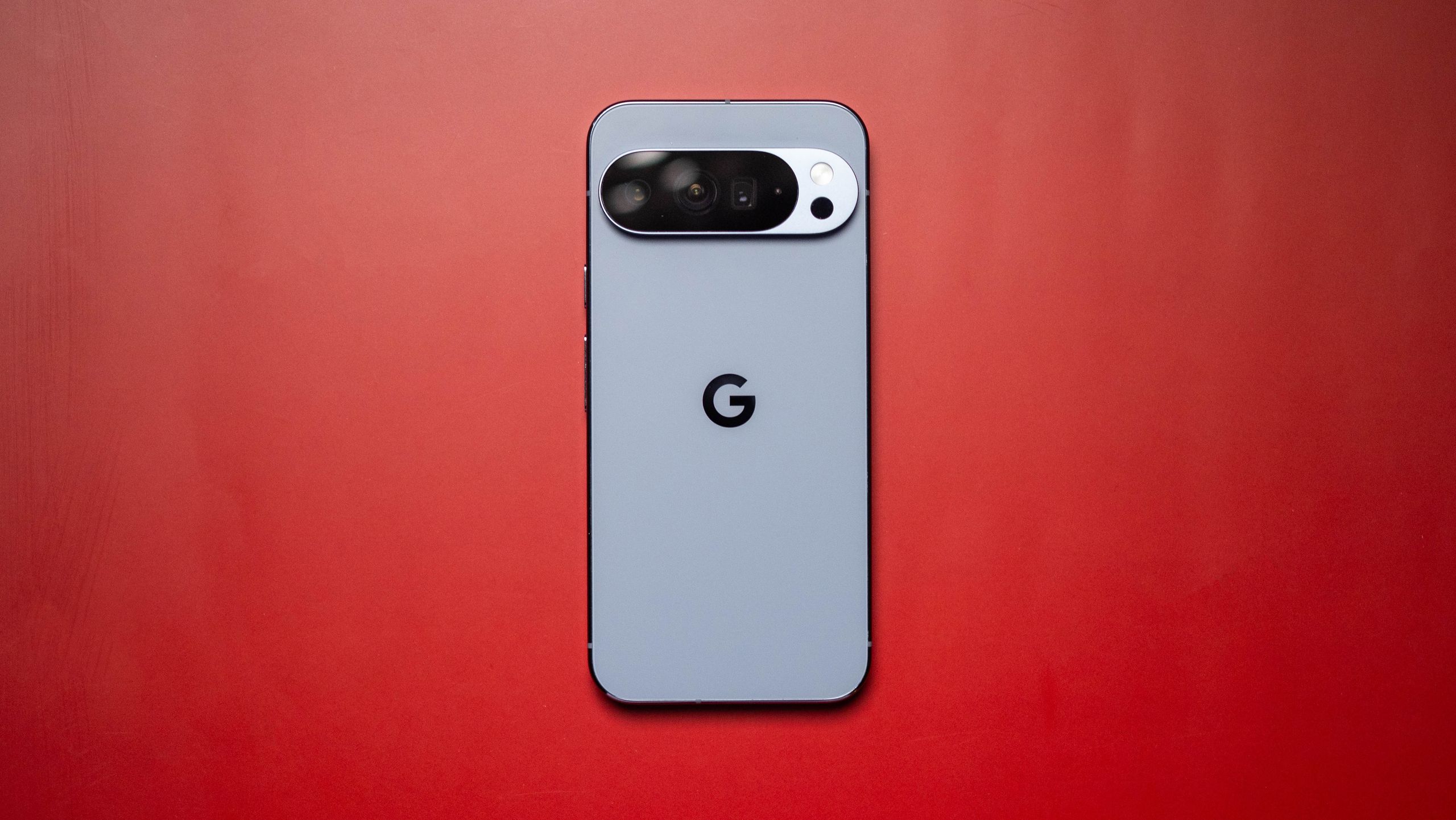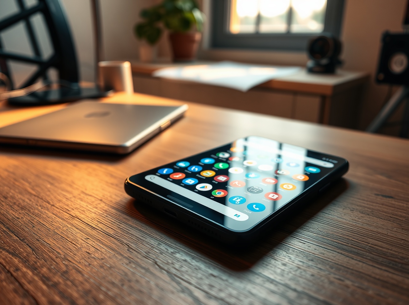
“Your wish is our command,” Android ecosystem chief Sameer Samat joked on X — and then Google actually shipped it. This week Pixel phones picked up a new custom icon style called “Disco,” a sparkly, mirror-ball makeover for app icons that’s simultaneously gleeful and divisive.
Google first introduced AI-generated custom icon styles in its March Pixel Drop, offering limited—but curated—themes like Scribbles, Treasure, Easel, Stardust and Cookies. Disco is the first new preset since that launch, and it leans hard into kitsch: each icon gets a tiny disco-ball texture on a dark background, complete with reflective highlights. The rollout arrived quickly after Samat’s cheeky tease, underscoring how fast Google can iterate on Pixel’s launcher presets.
How to get the disco look
If you’re on a Pixel and curious (or horrified), it’s easy to try. Long-press your home screen → Wallpaper & style → Icons → Create. Pick Disco from the generated styles, tap Download, and the Pixel Launcher will apply the pack to your apps. The system customizes icons with AI and lets you tweak color palettes, but it’s not the same as installing a third-party icon pack — you’re picking from Google’s approved presets rather than loading community-made sets.
That limitation is deliberate. The Pixel Launcher’s custom-icon flow is a controlled way for Google to offer playful options without opening the floodgates to anything that could break visual consistency or accessibility. Still, some users wish for full third-party support so they can drop in packs from designers rather than rely on AI-generated presets.
It's more than a gag
The Disco release is tied into a larger pattern: Google leaning into fast cultural moments and AI tooling. The disco-ball fad bubbled up online after a few community mockups and a short-lived glittery icon splash from Spotify, and Google moved from joke to feature in days. That responsiveness echoes the company’s recent focus on making Android and Pixel feel more playful and personalized — a theme that surfaced at this year’s I/O showcase and in continuing Android updates.
Technically, the icon styles piggyback on the same infrastructure that’s been evolving with Android releases. If you follow Android’s beta cycles, these customization hooks are the sort of polish that shows up alongside broader OS work like the latest Android 17 beta refinements.
Opinions: fun or overkill?
Reactions are mixed. Some Pixel owners love the whimsy — a quick way to make a home screen feel intentionally silly — while others call it garish or a step too far for daily use. The discourse around a single app’s temporary disco icon (yes, Spotify) shows how personal iconography has become: small visual elements can trigger surprisingly strong responses.
For Google, Disco is low-risk product theater. It’s reversible — you can switch styles back in seconds — but it keeps Pixel front-and-center in conversations about what Android customization should be. And it’s another example of how the company is using AI to generate UI elements that would previously have required manual design work.
If you’re already tired of the look before you try it, note that the SpongeBob-themed pack that showed up with March’s drop has already disappeared, so these preset libraries will continue to change. Whether Disco becomes a brief meme or an enduring choice for Pixel fans probably depends on how many people keep it past the novelty week.
Try it, screenshot it, share the chaos — and then quietly switch back if you can’t live with tiny mirror balls on your calendar icon.