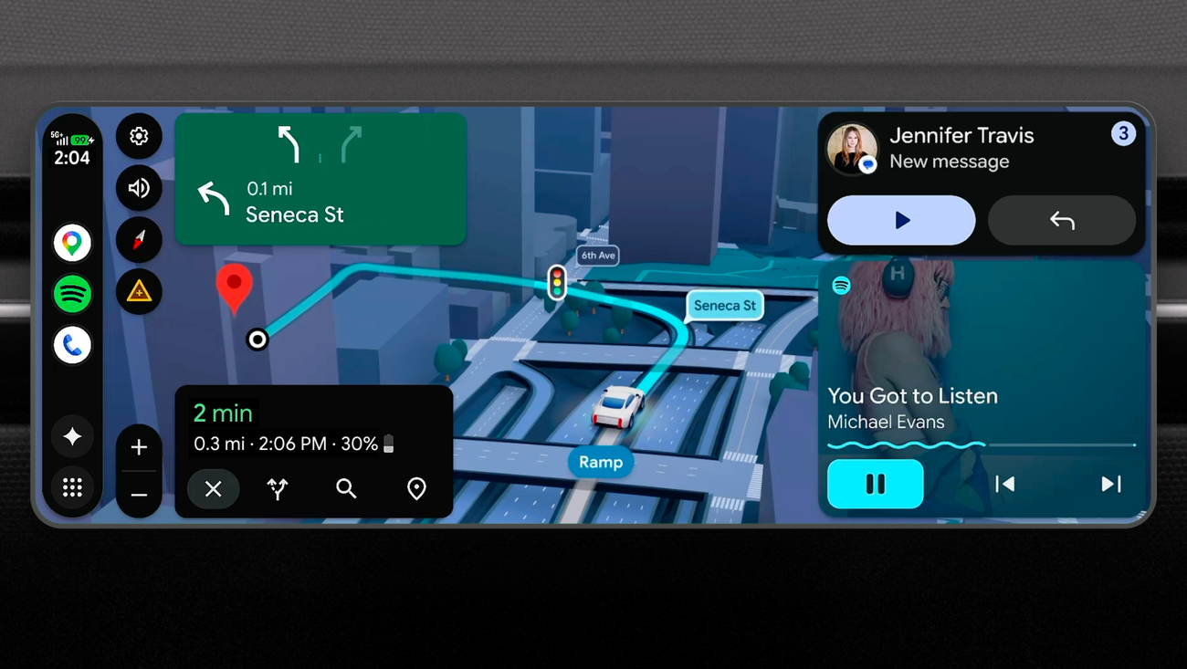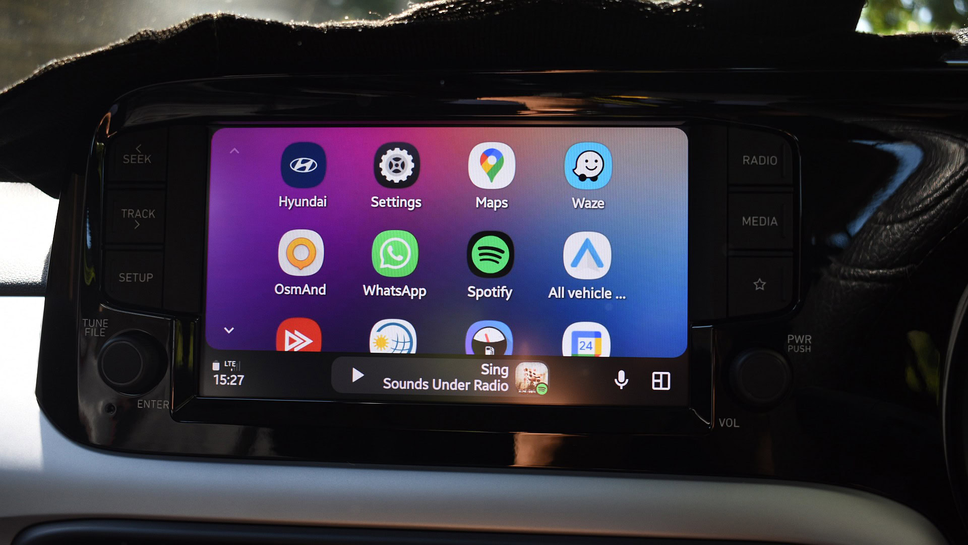
Ever tried to jump from an audiobook to a playlist while driving and ended up mucking about in menus? Google is rolling out a small but meaningful fix: Android Auto now supports multiple, swipeable media cards on the dashboard so you can cycle between active audio apps without reopening them each time.
This change is already appearing in the Android Auto beta (reported as version 17.0.162144-release.daily) and has begun to reach users. In practice it’s simple: instead of the dashboard showing only the single most recently used media app, Android Auto keeps several recent sessions available as separate cards. A quick swipe across the media area jumps you from Spotify to Audible to YouTube Music (or whatever you were using) — no app library detour required.
What this actually fixes
For years the one-card behavior felt more annoying than dangerous: switch from a podcast app to music and the previous controls vanished, forcing you to reopen the old app if you wanted to return. The new multi-card UI keeps recent media sessions accessible, which is faster and, crucially, safer because it reduces time spent navigating while driving.
There are a few wrinkles. The new swipe interface appears to surface apps you’ve used recently on Android Auto, so the first time you open an app you might still need the longer flow to launch it. We don’t yet have confirmation that media taskbar widgets are included — it looks like the cards come from active media sessions rather than widget instances.
This is part of a larger refresh
The swipeable cards aren’t happening in a vacuum. Google has been pushing a broader redesign and deeper AI integration into car UIs — think YouTube content accessible while parked, richer Maps detail via Immersive View, and Gemini-powered features that can act like an in-car assistant. Demo coverage and hands‑on writeups highlight things like Magic Cue and more customizable widgets, which together tilt Android Auto toward a more phone-like, context-aware cockpit.
That’s exciting, but it also raises real questions: will all cars display these extra visuals well (many head units are portrait-oriented or lower resolution), and how tolerant will users be of greater data and power use for cloud-powered features? Early hands-on impressions praised Gemini’s conversational strengths and smart reminders, but also flagged that when connectivity or processing hiccups occur, the experience can collapse quickly.
Why small changes matter
A swipe to switch audio might sound trivial, but it’s a classic example of polishing the bits of software people touch dozens of times a day. For drivers who spend long stretches on the road, the difference between fumbling through an app library and a single gesture can be the difference between a distracted glance and keeping eyes on the road.
There’s a business angle, too. Android Auto’s footprint — Google says hundreds of millions of compatible cars — makes it attractive for small businesses and services that rely on drivers. Smarter routing, voice-driven scheduling, and in-ride entertainment tie-ins open opportunities for delivery services, field teams, and advertisers, while also raising privacy and data-handling considerations that operators should understand.
Rollout, reliability and a cautionary note
Android Authority and other hands-on sources report the feature in beta right now; a wider stable rollout should follow. If you’re eager, the beta is the place to try it; otherwise expect a gradual arrival. And a quick caveat: Android Auto updates haven’t been flawless for everyone — some users have reported issues on Pixel and Galaxy phones after recent updates — so if you rely on Android Auto daily, keep an eye on compatibility reports and official fixes as features roll out.
If you want more context on the broader redesign Google is staging for vehicle dashboards, their recent refresh coverage digs into widgets, immersive maps, and video integration in more detail. You can also read about some of the earlier update hiccups when Android Auto behaved oddly on certain Pixel and Galaxy devices.
Try it next time you’re in the beta and swiping between your playlists, podcasts, and audiobooks. It’s one of those tiny UX moves that smooths a repeated friction point — and that’s exactly the kind of improvement you notice only after it’s been fixed.