Apple isn’t backing away from Liquid Glass, but it is quietly admitting the first version needed work.
With iOS 27, the company is giving users something they didn’t have last year: real control. Instead of the simple clear/tinted choice Apple added in iOS 26, the new beta includes a system-wide slider for Liquid Glass intensity. Move it toward the left and the interface becomes much clearer; slide the other way and you get the full translucent treatment Apple showed off at WWDC. The same approach is also arriving on iPad and Mac, though the Apple Watch is being left out for now, with watchOS 27 only getting Apple’s updated design language in a fixed form.
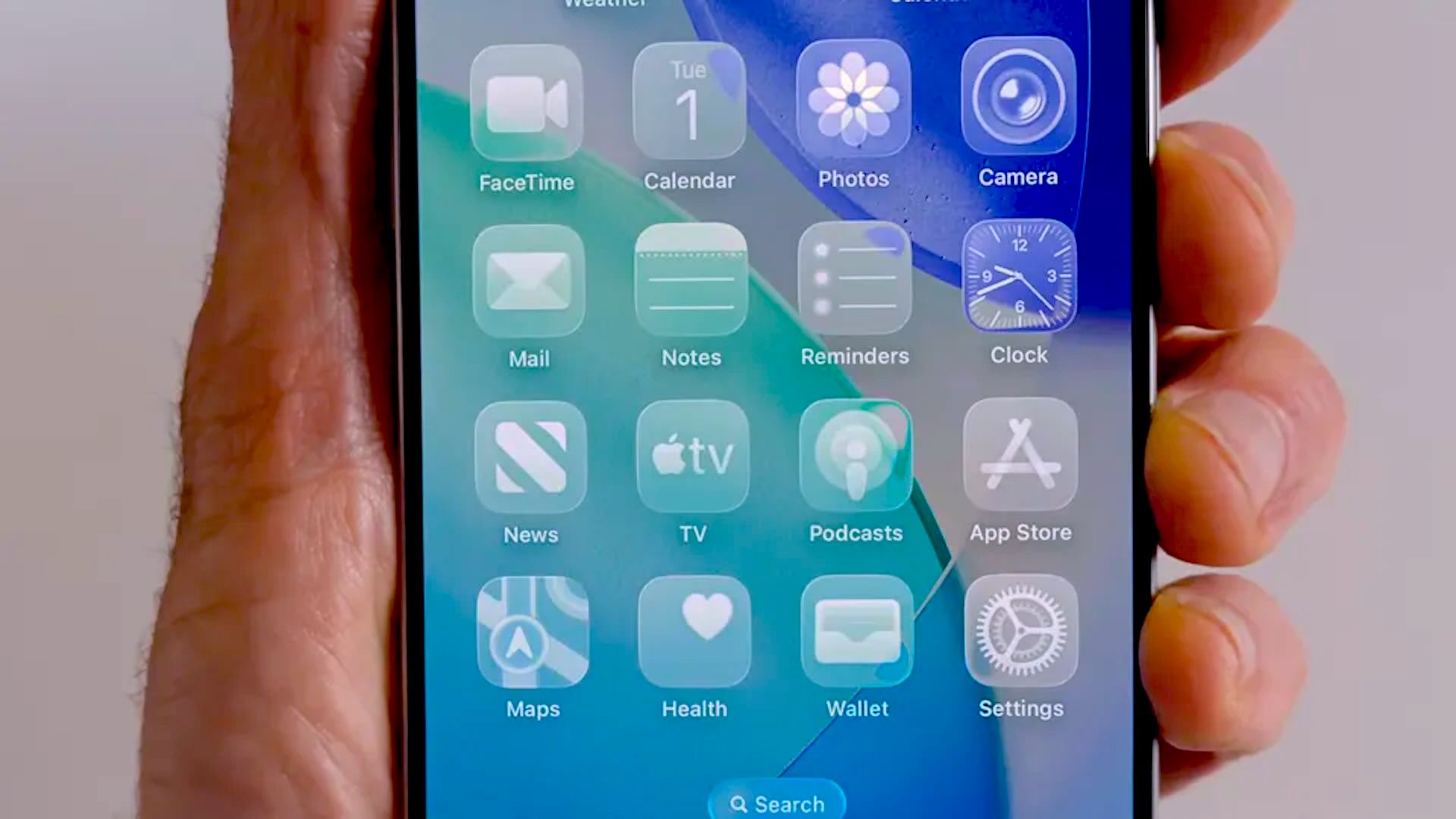
That matters because Liquid Glass was one of the most polarizing parts of the iOS 26 rollout. Some people liked the futuristic shimmer, but plenty of others hated the blurred icons, odd highlights and the way certain app symbols seemed to tilt when the phone moved. Readability was the loudest complaint, especially in dark mode, where the glow around icons could feel more distracting than decorative. Apple’s own software team seems to have taken the message seriously.
The new look is not a rollback. If anything, Apple has doubled down on the concept and just made it behave better. In the iOS 27 beta, Liquid Glass appears more transparent overall, but also more controlled. Backgrounds are less of a foggy mess, icon edges are sharper, and the darker borders Apple has added around some elements help them stand out without killing the effect entirely. The company is also using a more aggressive tint treatment, so the difference between “clear” and “tinted” is much more obvious than it was in iOS 26.
Apple has clearly been working on the icons themselves too. Instead of laying a glossy sheet of glass on top of the artwork, iOS 27 builds multiple Liquid Glass layers into the icon design. That gives first-party icons more depth and separation, and it seems to reduce the washed-out look that bothered so many users. MacRumors noted that the motion-based shimmer effect from iOS 26 also appears to have been removed, which would explain why the “tilted icon” illusion no longer shows up in the first beta. The result is still unmistakably Liquid Glass, just less theatrical.
If all of this sounds familiar, that’s because Apple has been on a broader cleanup pass across the whole interface. The same willingness to revisit rough edges showed up in other parts of iOS 26’s quieter fixes and workflow tweaks, where Apple spent time smoothing out features rather than chasing headline-grabbing reinventions. That’s the vibe here too: less spectacle, more sanding down the corners.
For developers, the changes are more than cosmetic. Apple has updated its Icon Composer tool so app makers can build icons from multiple Liquid Glass layers and preview how they will look in the system. That should help third-party apps avoid the blurry, over-shined look that some of Apple’s own icons had in iOS 26. It also points to a more consistent rollout once the public release arrives later this year.
On the Apple Watch side, the story is more restrained. watchOS 27 does adjust Liquid Glass in subtle ways, but there’s no slider there. It’s a reminder that Apple is still deciding where this design language makes sense and where it may need to stay a little more fixed. The same attention to interface tuning is showing up elsewhere in Apple’s software stack too, from keyboard and emoji changes in iOS 26.4 to broader feature updates across the platform.
I spent time comparing the iOS 27 beta against iOS 26, and the differences are easy to miss until you look closely. The new interface doesn’t scream for attention. In some places, that’s a good thing. The app list looks cleaner and the translucent panels no longer dominate the screen with a cloudy blur. In others, the extra transparency goes a bit too far, and small UI elements like the search bar can become harder to read than they should be. Apple is still balancing style and usability, and the slider is basically the company admitting that one size doesn’t fit everyone.
That flexibility is probably the biggest change of all. Apple spent the last year defending Liquid Glass as a bold visual refresh. iOS 27 feels more like a refinement phase, where the company is trying to keep the aesthetic while making it easier to live with day to day. It’s a smarter move than pretending the complaints never happened.
And for users who still want the old level of frosted separation, the answer is now simple: turn the intensity down and move on.