Apple’s glassy redesign is getting a reality check.
With iOS 27, the company is not just adding a simple transparency slider to Liquid Glass — it is also smoothing out some of the design’s roughest edges. The result is a cleaner, more adjustable interface that looks less like a bold experiment and more like something Apple is actually happy to let millions of people live with every day.
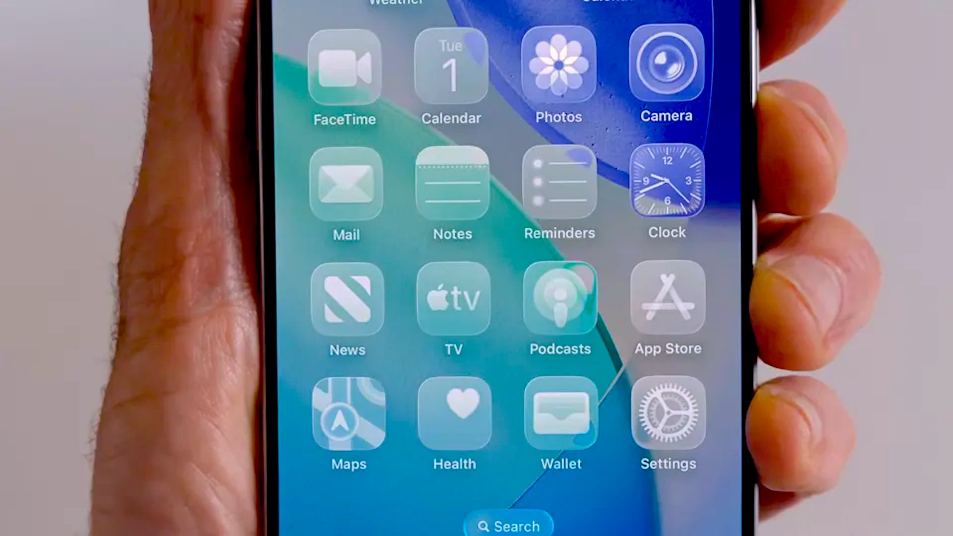
The big change is easy to spot. Apple has removed the specular highlights that made Home Screen and Control Center icons appear to tilt as you moved the phone. That effect, which caused enough confusion to make some users swear their icons looked crooked, turned out to be an optical illusion driven by motion-aware lighting. In the first iOS 27 developer beta, that visual trick is gone, and the icons sit still like they should.
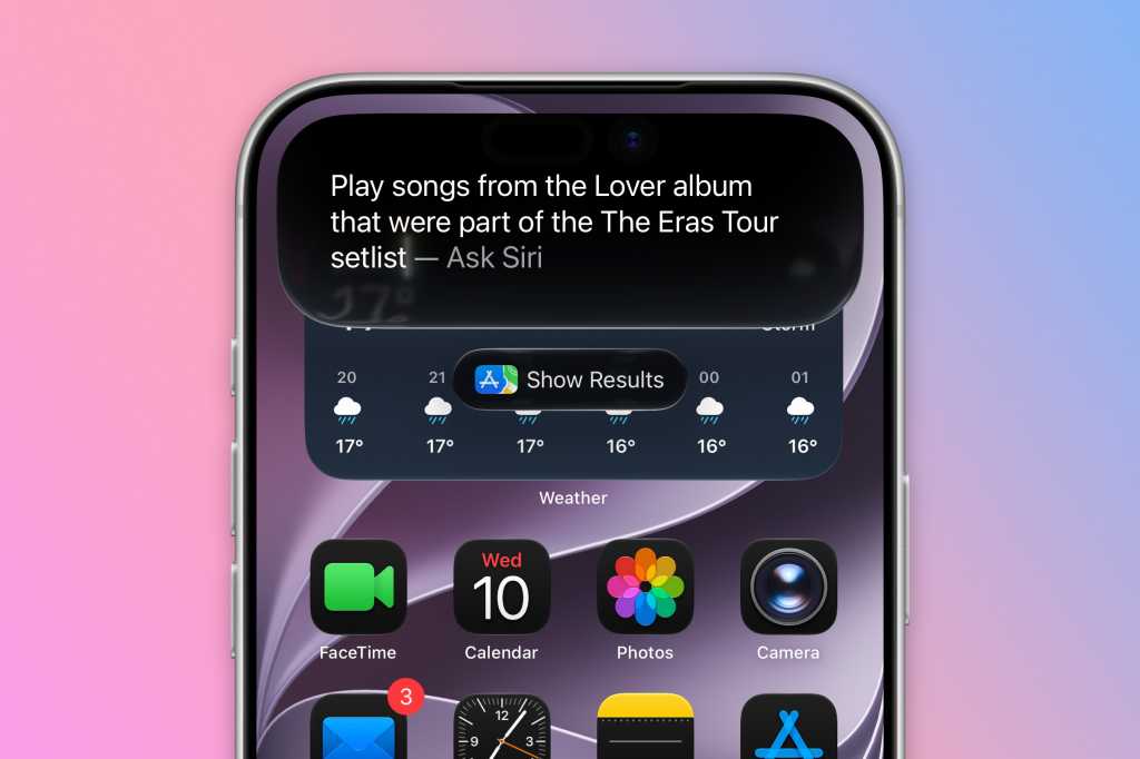
That alone would be a notable tweak, but it’s not the whole story. Apple is also giving users much finer control over Liquid Glass transparency. Instead of a simple on/off choice, iOS 27 includes a slider that lets you dial the effect from highly transparent to almost fully opaque. On one end, the interface keeps its airy, layered look. On the other, it gets frosted enough that readability becomes much less of a fight.
That matters because readability was the original complaint. Liquid Glass looked striking in Apple’s demos, but in real use it could be messy: text layered over text, notifications competing with busy wallpapers, and controls that sometimes felt more decorative than useful. Apple already responded once by adding a blunt reduce-transparency option in iOS 26. Now it’s doing the more thoughtful version of that fix.
The company seems to have learned something important: if you build a design language around translucency, people will absolutely ask for a way to turn the translucency down. That’s true on iPhone, and it’s just as true on Mac, where Apple is now adding similar controls in macOS Golden Gate. The visual language remains, but the panic button is finally built in.
Some of the best context around this comes from the broader direction of Apple’s software updates. This year’s WWDC wasn’t only about flashier visuals; it also leaned heavily on practical improvements, from Siri’s redesign and multitasking experiments to the company’s ongoing cleanup of iOS 27 itself. In other words, Apple appears to be spending a lot of time sanding down the edges of last year’s big ideas.
That’s especially clear if you compare Liquid Glass with Apple’s other recent software changes. The company has been moving toward more adjustable, user-friendly defaults across the board, including fixes and refinements in iOS 26.4’s practical update cycle and the more security-minded work in Apple’s background patching efforts. The pattern is hard to miss: Apple launches the vision, then spends the next release making it usable.
For designers and developers, there’s another layer to this. Apple has already published updated design resources showing the revised Liquid Glass icons, badges, and interface pieces that app makers will need to match. So this is not a tiny cosmetic adjustment hidden in a beta note. It’s a system-level rethink of how the look should behave, and how much of it users should actually have to see.
Apple still clearly believes in the aesthetic. Liquid Glass is not disappearing, and neither is the company’s obsession with making software feel sculpted rather than merely functional. But the mood has shifted. The tone now is less “look at this future” and more “fine, you can tune it until it stops annoying you.”
That may not sound glamorous, yet it’s probably the smartest thing Apple has done with the design since launching it in the first place.