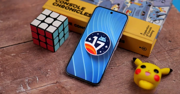
Tired of accidentally scrubbing your audiobook while trying to switch apps? Google looks to have heard you. In Android 17 QPR1 Beta 3 the longtime carousel-style Now Playing controls have been redesigned into a compact, multi-card — or “pill” — layout that you can tap to switch between active and recent media sessions.
The change is small on paper but noticeable in practice. Instead of a single large player you swipe left or right through, Android 17 shows the primary player front-and-center with vertical pills on either side representing other media apps or resumable sessions. Tap a pill to jump straight to that app, or still swipe if you prefer. The point is to reduce the common annoyance of unintentionally touching the seek bar while swiping and accidentally skipping or fast-forwarding playback.
Why it matters
For people who juggle music, podcasts and audiobooks on the same phone, media switching has been a frequent source of friction. The old carousel mixed seek gestures and app-switch gestures in one narrow strip — not a great recipe on phones with smaller screens. The pill design separates those actions visually and functionally, making it quicker and safer to swap sources without losing your place.
Small trade-offs, real gains
Nothing’s perfect. The new layout squeezes extra elements into the same vertical real estate, which could make the central player feel slightly smaller — a complaint already voiced by users with smaller Pixel models. Swiping between pills remains an option, so habits won’t be broken overnight, but some will want an option to scale the media controls up or down. For now, the interface leans toward efficiency over maximal visibility.
Context inside Android 17
This tweak is one of many little refinements arriving in the Android 17 beta stream. Alongside the media UI, Beta 3 ships a handful of other interface and stability improvements that change how people interact with notifications, Quick Settings and floating apps. If you’re tracking the release cadence or testing features on a Pixel, the update is part of the broader QPR1 Beta sequence that has already introduced things like a more compact output switcher and Material 3-styled card treatments. See the roundup of recent Android 17 beta additions for more background on what else is arriving in this update: Android 17 Beta 3: one‑tap Wi‑Fi returns, true floating apps arrive and Google teases faster charging.
Who can try it
The media switcher is available in QPR1 Beta 3 on supported Pixel devices enrolled in the beta. If you’ve been following the beta releases (and the fixes that landed in Beta 2), this is the next iterative polish that improves day-to-day phone use: Android 17 QPR1 Beta 2 arrives on Pixels with a raft of fixes.
A few final notes
Design changes like this rarely inspire universal applause, but they do highlight a simple truth: small UI details shape how we experience software more than we realize. Whether you love the new tappable pills or miss the big, swipeable player, this feels like a thoughtful fix for a repeatedly annoying problem — and an example of Google quietly iterating where it counts.