Android’s next big visual reset is starting to come into focus, and Oppo is at the center of it.
ColorOS 17, the company’s Android 17-based software skin, is set to be unveiled on September 17, with rollout timing and supported devices expected to be confirmed at the same event. For OnePlus users, the update matters too: the brand is moving away from OxygenOS as a distinct identity and deeper into Oppo’s shared software stack. In practice, that means many eligible OnePlus phones will eventually jump from OxygenOS 16 to ColorOS 17, not to a separate OnePlus-branded interface.
That sounds dramatic, but the change may feel more like a polish pass than a full reinvention. The two skins have shared a codebase since 2022, so the underlying experience is already closely aligned. Still, ColorOS 17 appears to be leaning harder into Oppo’s preferred language of transparency, motion, and layered depth. Think less flat Android, more glassy surfaces with rounded edges and animated transitions that try to feel a little more physical.
A softer, shinier interface
The biggest visual shift is the UI treatment Oppo is calling its Liquid Acrylic style. In practical terms, that means more translucency, rounded controls, floating navigation elements, and a heavier use of blur and layered surfaces across system apps. The Quick Settings panel, notification center, photos app, settings screens, and media controls all appear to be getting this treatment.
That redesign extends beyond looks. The navigation bar is reportedly moving to a transparent capsule-style design, while sliders for volume and brightness gain more space and finer control. The lock screen is also changing, with a more flexible clock layout and new animation effects that try to make the whole interface feel less static.
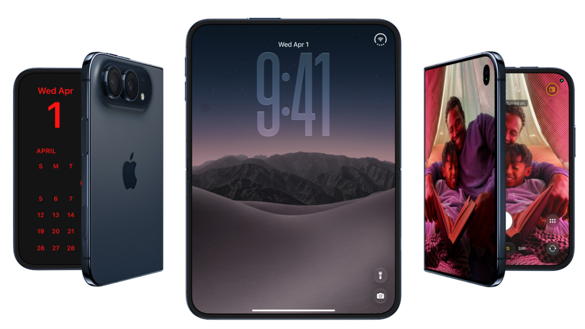
If this sounds familiar, it’s because the broader mobile industry has been circling the same aesthetic from different angles. vivo’s OriginOS 7 is heading in a similarly glassy direction, and Apple’s own design language has clearly influenced the conversation. Oppo, though, seems to be taking that inspiration and tuning it for motion-heavy Android UI rather than copying the look wholesale.
The parts users will actually notice
Some changes are cosmetic, but others should be obvious the moment you unlock the phone. Recent leaks and beta builds point to a redesigned Control Center with fully circular toggles, a frosted-glass appearance, and more pronounced separation between the control panel and notification shade. There are also bouncy transitions when you swipe between the two, which sounds minor until you spend all day tapping through them.
The lock screen is getting more attention than usual. Oppo is testing new Fluid Clock behavior, including better positioning, smarter scaling around widgets and notifications, and more styling options. There’s also talk of a themed lock screen layer, new animations, and broader customization through themes and stickers.
Media playback gets a cleanup too. The player appears to use dynamic color extraction from album art, while the volume controls and audio routing tools become easier to reach from the shade. Even the flashlight interface is said to be getting a refresh, with swipe-based brightness control. Small stuff? Sure. But small stuff is what users actually touch every day.
Performance changes hiding under the gloss
ColorOS 17 isn’t just about making phones look more expensive. Oppo says there are also under-the-hood improvements to memory handling, thermal efficiency, and animation smoothness. Beta reports mention an “unfair scheduling” algorithm designed to keep performance stable, plus Storage Compression 2.0, which should help reclaim space automatically.
For people who care more about speed than shimmer, that matters. A prettier interface is fine. A prettier interface that still feels snappy under pressure is much better. Oppo seems to know that, which is why the update is being framed as both a design refresh and a systems overhaul.
There’s also a broader trend here. Big Android skins are no longer competing just on features; they’re competing on feel. Android 17 Beta 3 already hinted at more fluid multitasking and interface movement, and ColorOS 17 looks like another sign that the platform is drifting toward richer motion, deeper layering, and less of the old utilitarian Android look.
Who gets it, and when
Oppo hasn’t published the official device list yet, but the company is expected to support a wide range of recent Find X, Reno, K, F, and Pad models. A few of the latest foldables and flagships are obvious candidates, and the rollout will almost certainly begin in China before expanding to global markets.
That global piece is the part to watch. Oppo’s event is scheduled for September 17, but there’s still some uncertainty about how much of the rollout plan will apply to international devices right away. OnePlus owners outside China may need to wait a bit longer for clarity, especially since regional software strategies have been getting more complicated, not less.
U.S. users may also notice one odd upside of that regional split: some ad-heavy extras tied to Lock Screen Magazine, Game Center, and the App Market won’t be coming to American OnePlus phones, largely because Oppo pulled HeyTap hosting from the country after regulatory scrutiny. In other words, the absence of a few features might actually be a win.
For Oppo, though, ColorOS 17 is bigger than a single launch event. It’s part of a wider attempt to make Android skins feel more coherent, more tactile, and more premium without losing the speed users expect. If the early leaks hold up, the company is betting that a good-looking interface can still feel useful — not just decorative.
And judging by the design direction from Oppo, vivo, and the rest of the Chinese Android field, the glass era is only just getting started.